
Cardsembly 1.1 Released

We're excited to announce Cardsembly 1.1, packed with new features and improvements that make building custom HubSpot cards faster, more intuitive, and more flexible than ever before. Since our initial release in 2025, we've been hard at work listening to your feedback and shipping updates that transform how you create custom HubSpot cards.
What's New in v1.1
Sub-Automations
One of the most powerful additions to Cardsembly is sub-automations, the ability to trigger separate automations from within your cards. This opens up endless possibilities for building sophisticated, interactive workflows:
- Form Submissions: When a user submits a form in your card, automatically trigger an automation to process the data, push it to Google Sheets, Zapier, send emails...
- Button Actions: Add buttons that start automations, make a change in another system, start a Zap...
- Dropdowns: When a dropdown is selected, you can use that selection to run a sub-automation and fetch more data. For example, select a quote, run a sub-automation to fetch the line items.
- On Load: The Box component has the ability to run sub-automations when it's loaded, which is useful when switching between tabs using the new Tab Switcher component.
This feature essentially turns your HubSpot cards into interactive applications that can modify data, trigger external services, and orchestrate complex business processes.
80% Performance Increase
We've significantly optimized initial card rendering and data loading, resulting in noticeably faster load times when viewing cards in HubSpot.
Layers
We've introduced a component hierarchy panel that gives you a bird's-eye view of your entire card structure. Hover over any component, including data tags such as forms, and watch it light up on the canvas, making it easy to understand your card components and how your data flows through the UI.
Custom Objects and New Standard Objects
We now support custom objects as well as additional standard objects such as Appointments, Courses, Listings, and Services.
Best New Component
The new Show Data Tags component significantly simplifies the process of displaying HubSpot or 3rd party properties in your cards.
Instead of manually drag and dropping individual components for e.g. 10 properties, you just select the properties from a dropdown and select their style.
Other New Components
- Dropdowns
- Buttons
- Forms
- Multi-Step Forms
- Tabs Switcher
- Page Switcher
- Bar Chart
- Score Circle
- Progress Bar
- Table
- Divider
- Illustrated Messages
- Accordion
- If/Else Conditional Rendering
- HTML
New Integrations
ShipStation
Box
Teamwork
Instantly.ai
Moneybird
Improved Automation Runs
The automation runs page now shows comprehensive details including:
- Which user viewed the card
- Which object was viewed and where in HubSpot
- Exact timing and performance metrics for each automation step
- All card views are now recorded, even when no automation actions are triggered
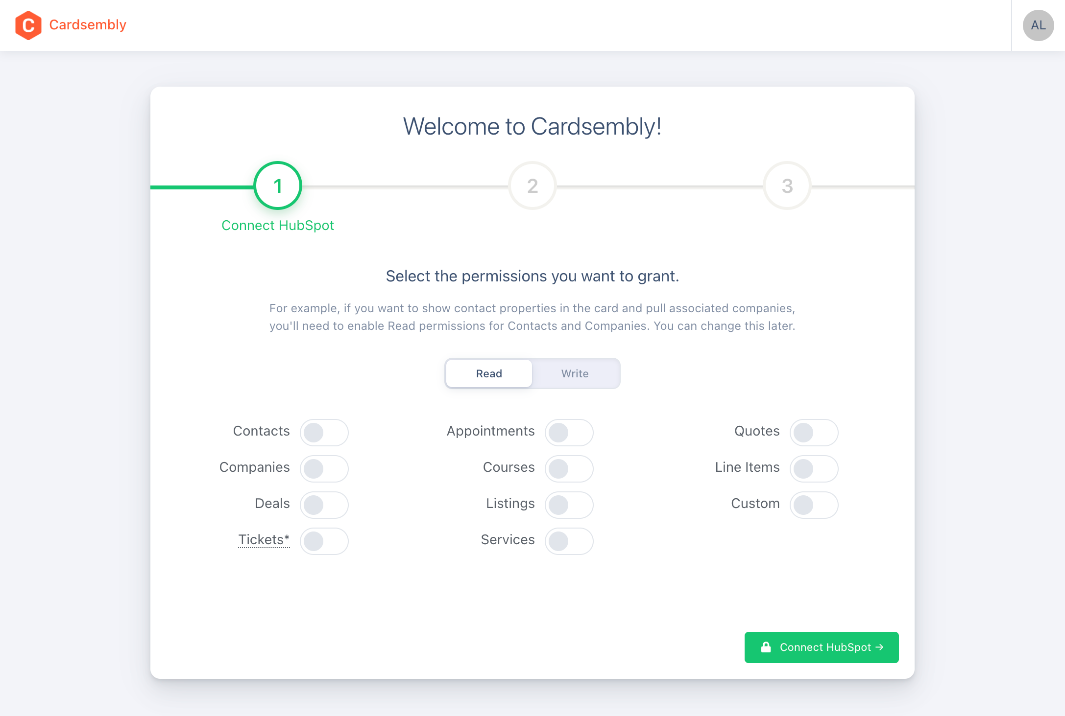
Improved Security with Granular Scopes
You can now choose exactly which permissions to give when connecting Cardsembly.
Unsaved Changes Protection
The editor now tracks unsaved changes and prompts you before navigating away, preventing accidental data loss when switching between tabs or closing the browser.
Duplicate, Copy and Paste Components
You can now easily duplicate components, or copy and paste components between pages.
Bug Fixes & Improvements
We've also shipped dozens of bug fixes and improvements to existing functionality.
Get Started Today
If you haven't tried Cardsembly yet, sign up to get started.
For existing users, these updates are already live.
We'd love to hear what you think. Reach out to our team with feedback or feature requests.
Happy card building!