
Cardsembly 1.2 Released

Cardsembly 1.2 is out! Since the previous release we've improved the building experience, starting with an AI that turns your input into a working card, an improved editor to make building cards easier, and dozens of deeper improvements across Cardsembly.
What's New in v1.2
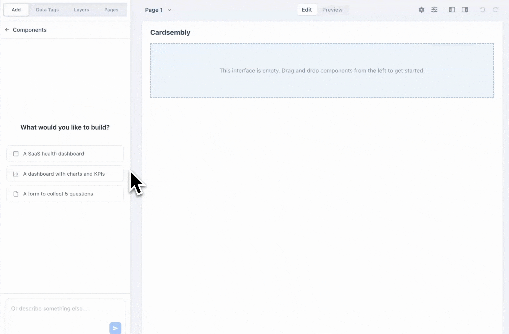
Build Cards with AI
Describe what you want, "a SaaS health dashboard" or "a dashboard with charts and KPIs" and watch it assemble on the canvas in real time.
It understands the HubSpot and third-party data tags available on your card, so it can wire up dynamic fields. Every AI change lands in your normal undo history, so you're always in control.
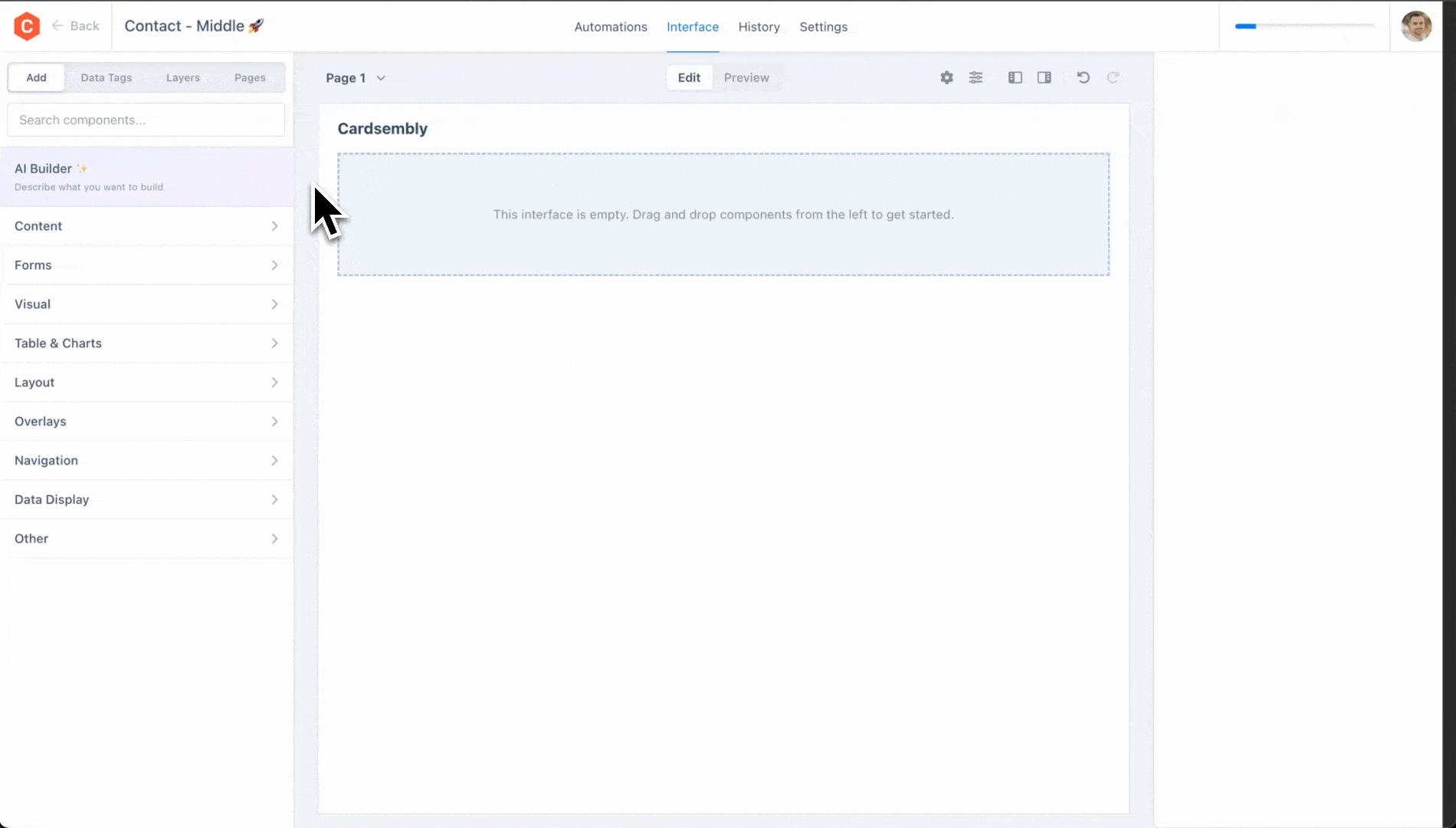
Browse components by category with live previews
The Add components panel was redesigned. Hover a category to open a flyout with live preview of components, or use the new search box to jump straight to what you need.
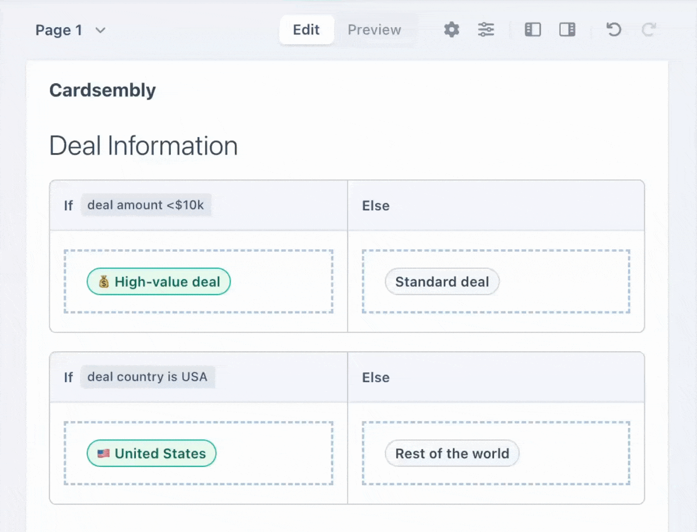
Preview If/Else Conditions
Say you want to highlight high-value deals when "deal amount is greater than 10,000 and country is United States." Previously, conditions like this were difficult to test and preview.
Now with the redesigned If/Else component, you also have a conditions menu in the toolbar, where you can flip between true and false (or show both) so you can see exactly what each outcome looks like.
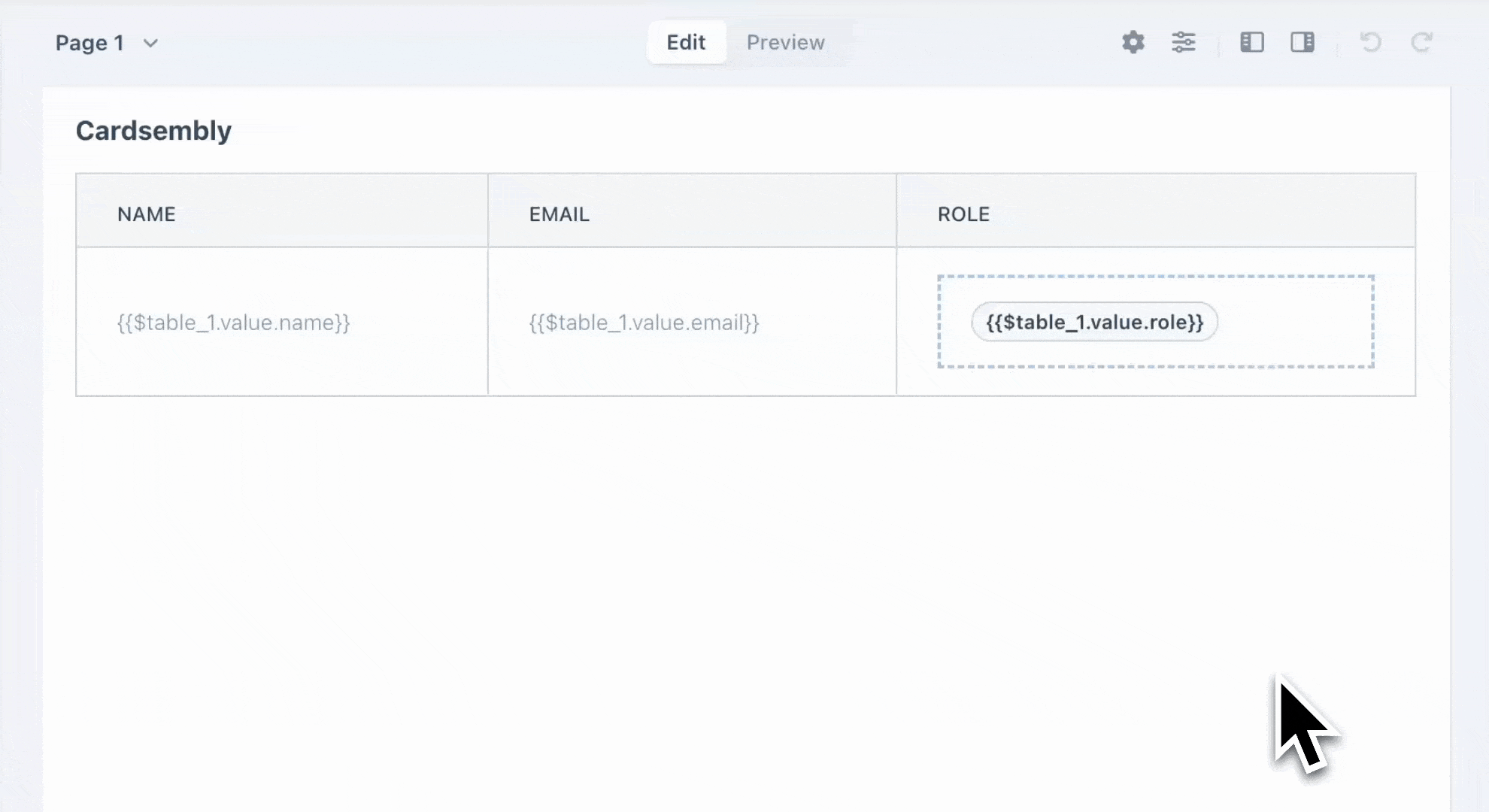
Sort, Filter and Customize Tables
People viewing tables can now sort, filter and page through with built-in pagination.
There are now two modes when building tables:
- Simple mode turns CSV text or an array of objects straight into a table, with headers detected automatically.
- Custom mode lets you define your own columns and turn any column into a custom cell containing buttons, badges, images or any other component.
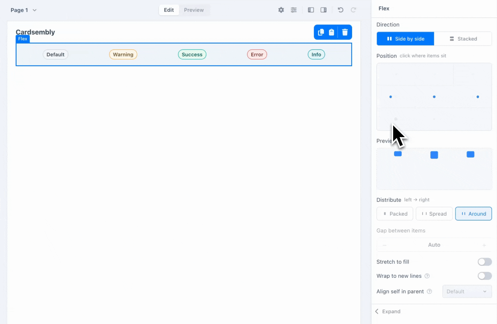
Arrange layouts with Flex
Aligning and arranging components used to mean wrestling with multiple separate flexbox dropdowns. In 1.2, the Flex component has a brand-new visual layout editor that speaks plain language.
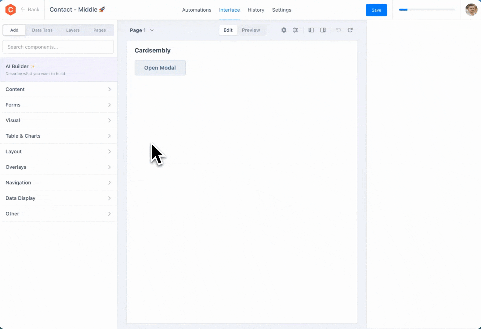
Edit Modals and Panels on the Full Canvas
Modals and slide-out panels no longer clutter your layout. Click Edit to open an overlay across the full canvas, where you can build its contents just like any other page. Each overlay also appears as its own entry in the Pages panel.
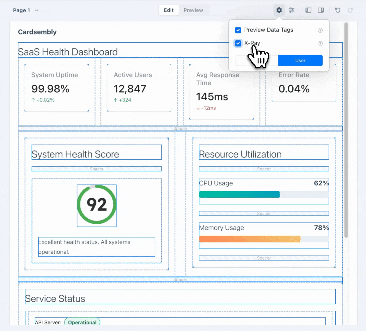
X-Ray
Complex cards can get deeply nested. Turn on X-Ray from the editor's toolbar and it'll outline every component, so you can see exactly how a card is put together.
Other Improvements
- Editor improvements: new toolbar, new pages panel, improved highlight of hovered/selected components, ability to hide left/right panels, undo history fixes, selected component breadcrumbs, horizontal scrolling of nested components.
- Spacer: a new layout component for whitespace between components.
- Tabs: can now stretch to full width, and a new Enclosed style gives you boxed, segmented tabs.
- A single Image component can now show up to 20 images, including from a single HubSpot file property that holds several files.
- New HubSpot actions: Automations now have new actions such as "Get Object Files", "Get Marketing Events" and more.
- More objects: added support for HubSpot Orders and Projects objects.
- Preview data tags by default: the editor now shows your
{{$data.tags}}filled with real values as you build. Toggle it off any time to see the raw tags. - Data tags suggestions: when editing a component that requires an array, instead of dragging and dropping a data tag, you can click the input field to get a suggested list of arrays you can use.
- Sub-automation outputs: when a card action runs a sub-automation, its outputs appear automatically as data tags.
- Click-through editing: click tab headers and multi-step indicators directly on the canvas to navigate between tabs and steps while you build, exactly like an end user would.
- New formula helpers: or, equal, not-equal, get, replace, now, find-by, item-at, map-by, join, unique, unique-by, concat, sum, lower, upper, startCase, format-currency, format-digits, encodeURL, absolute.
Integrations
Three new integrations:
Everhour
DecoNetwork
Brevo
- Everhour: time tracking, with actions for projects, clients, users, and timesheets.
- DecoNetwork: print & decoration commerce.
- Brevo: email marketing.
We also added and expanded actions across the existing integrations:
- Notion: get, append, and read database items and page content, list databases, and create comments.
- Google Sheets: a new Get Row action, plus an optional range on Get Rows.
- ShipStation: List Shipments and Get Order, plus Bill-To address support on Create Order.
- QuickBooks: a richer Update Invoice: invoice-level tax, discounts, and tax-after-discount handling.
- Mailchimp: custom fields when creating or updating subscribers.
- Invoiced: new List Custom Fields and Add Custom Field actions, plus parent-customer linking and consolidated invoicing when creating or updating customers.
- Pipedrive: Add Organization, plus organization linking on Update Person.
White-Label for Partners
Building cards for clients? Cardsembly can now be white-labeled for partners and agencies. Ship the cards your team builds under your own brand, with Cardsembly-specific UI stripped from partner deployments. Talk to our team.
Get Started Today
If you haven't tried Cardsembly yet, sign up to get started.
For existing users, these updates are already live.
We'd love to hear what you think. Reach out to our team with feedback or feature requests.
Happy card building!